Tuesday, May 19, 2009

Hairy McCleary

Yoinked from the ever wonderful Dieline, this delightful bag was created for a women's hair salon by Serbian firm Peter Gregson.

Apparently hand drawn especially for this project. Ouch.

The contrast of the bright red logo with the busy patterned background is great, I really like that kind of juxtaposition. This keyboard seems a bit unresponsive so I'll keep it short. Great quality, great use of colours, great theme, great illustration! Love it!

Tuesday, April 21, 2009

Packaging design!


Above are two of my own packaging designs for a startup vodka premix line by One Part, based out of New York. The brief was for a front, back and neck label that incorporated their logo (the octopus with the umbrella) and a label which was refined, eye-catching and appealed to the demographic of 18-25yo males and females.

I presented the black label concept first, but found out they were after a more traditional British vibe. With the second concept (silver labels) I introduced a more traditional shape and incorporated their logo on the main label. I thought the use of silver and black was a fairly unisex approach. With the style, I tried to be innovative and think outside the standard oval shape. I introduced basic illustration to brighten up the label and also to colour-code for each flavour.

My favoured version is the black labels, I think they're fairly attention-grabbing.. Unfortunately neither concepts were chosen but it did give me a little experience in packaging design and it's definitely something that appeals to me.

Tuesday, April 7, 2009


Est is a Brazilian skincare company. I found this on www.thedieline.com, which is fast becoming my favourite site. Brazilian design firm Satelite produced this packaging.

The function is to present the product in a classic and understated way.

What really caught my eye is that the typography plays two roles, obviously the typographical role but also the graphic role, which I think creates an awesome effect. The diagonals are reminiscent of Constructivism, though the typography is serif. It's quite minimal but that's what made such an impression on me. The use of colour defines what scent or flavour the product is inspired from.

I think the quality is exceptional in its simplicity. The pastel colours also work well within the skincare range, generating a calm and restful air.

I think packaging design is a great way to not only sell products but also showcase design!

Thursday, March 19, 2009

Early modernism, today!

I spied this ad for IBM in the Design Graphics mag issue #59. It's function is to display the product in a racy way.

The style comes across as a sort of homage to early modernism, in particular the function and form of De Stijl shown in the tricycle, and Constructivism in the grid format of the text in a sans-serif font, with horizontals and verticals all aligning in order.

The use of white space is effective in drawing your eye straight to the main focal point, being the computer.

The header text "wanna race?" is entirely lowercase with a fullstop breaking the text up. All lowercase typography is so passe, they were doing it in the 30's.

Get with the times IBM.

Wednesday, March 18, 2009

Got milk?


How crazy are these milk cartons?? I found them over on http://www.thedieline.com/. They were designed by David Fung. It caught my eye as it's such an unusual packaging for an everyday item like milk.


The function seems to be to present milk in a fun new way. The colours correspond to the type of milk, which is a good visual method for your customers to rely on for distinguishing the differences. The use of flat white gives us an idea of the milk inside, which I thought was a great simple effect instead of opting for a more detailed approach. The droplet running from the spout and splashing at the bottom also adds a nice touch to break up the white and to keep the repetition of colour from each side.


The style has an almost De Stil / Pop Art feel to it. The use of solid blocks of colour contrasted against white is brilliant. The colour scheme shown here is pretty much a triad as well, I can imagine a whole aisle of this milk would look pretty speccy.


I particularly like the typography - for such a modern take on milk, I would have expected a heavier sans-serif font. The slim, simple font they've used works really well however.


I think the quality is excellent, it really shows a well executed 'outside the box' concept and I would totally buy this milk if I saw it at Woolies!


EDIT: It seems that designing milk cartons may be a standard part of a design degree, as I found some more cartons in a similar style.. Check it out..


I'm not really digging the thick outlined cow on these..


This has a cute 'Whitmans Sampler' cottage feel to it. Life is like a box of cows..


Nothing gets me more amped for some serious milk drinking than Mexico's Day of the Dead. Very cool.


Thursday, March 12, 2009

Business card design


Above is a business card for Shikaku (www.shikakufx.com) designed by Miguel Vega (www.accent.tv). It is printed on cardstock with Spot Gloss UV Varnish on the transparent logo, to create an interesting shift depending on where the light hits.

The function of a business card is to provide your business identity and contact info in an eye-catching manner to current or prospective clients. This particular card caught my eye with the complementary colour scheme, 90% green with 10% red. It also embodies the "less is more" approach to design with just the company logo set to the left quite small, which is very effective and draws the eye.

The organic green abstractions fit in with the company profile, which is a visual effects production for electronic music gigs. The back of the card contains the bare minimum of contact information on a cream background.

The typography is modern and sans-serif, with use of bold to draw attention to his name. The style is quite modern and seems popular at the moment, I've noticed these sorts of organic light graphics with Apple backgrounds and the screensaver Flurry.

The quality is great, the designer achieved a great finish by combining print press techniques with the digital design element. Overall I thought it was a pretty neat business card and it definitely caught my attention...

Monday, March 9, 2009

Alberto Seveso


Alberto Seveso is an Italian illustrator & designer (http://www.burdu976.com/). I came across his work whilst browsing design portfolios and his distinct style caught my eye. These are illustrations in set 'Vintage976'.


The style is beautiful. In this particular set he captures a whimsical & vintage feel, the clever combination of photography and illustration flow seamlessly between one another.


The colour palette is soft and subdued, with minor compliments between the yellows and purples, blue and oranges.


The quality of the artwork is amazing. His style is unique and unlike anything I have seen before. I love the combination of photography and design.
Seveso's website showcases his diverse talents and I hope you take some time to have a look, this vintage theme seems to be a step out of the comfort zone for him and I think you will be surprised at the darker work he has to offer...
Overall very inspirational work, even if a little disheartening in the amount of skill and time it would take to achieve such awesome results!


Thursday, February 26, 2009

Digital illustration


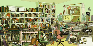
Above is a hand-drawn/digital illustration for an EP by American illustration team Kozyndan (www.kozyndan.com - love them!). The title is "The Audience". The function is to be a wraparound record cover, showing the artist in his studio mixing music.

I found out about Kozyndan a few years ago and have been following them since. They have now landed major contracts with Converse and other big brands, which is testament to the quality of their work.

The style is fresh, bright and simplistic (even though it looks so cluttered). The piece is drawn in pencil first then scanned in and coloured using Photoshop. The tones in the image work harmoniously with one another, with subtle contrasts of tint with pink and green. I would say it is mostly in two thirds, with the top of the drawing remaining mostly bare compared to the chaos below. I think the intent of the drawing was to present a feeling of organised chaos. The cute creatures are customary of Kozyndan's work and add a sense of wonder.

The quality is evident in the perspectives of the room. Panoramas are quite difficult to draw whilst still retaining believable proportions, and is something they are great at.

These guys are super talented and I'd encourage you to check them out!


Thursday, February 19, 2009

Promotional posters


Above are promotional posters for various Tarantino films. I decided to include a few as they all share similar design aspects. The function of the posters is to grab your attention and pique the viewer's interest in the respective films. I have seen these posters at cinemas, video stores, on DVD covers and merchandise, as often cinema is marketed through many avenues ($$chaching$$).

The style in all of the posters is retro. The consistent use of red, black and yellow is evident in all (a nod to the first of colour printing in the 1800's perhaps?), the stenciled typography and the screen print effect give it a 70's feel. The posters all abide to the rule of thirds also.

The quality of the design is in it's apparent 'non-quality'. The distressed look in the Pulp Fiction poster mimics the textures of a well-read book, the hard edged and bold use of black print in Reservoir Dogs is simple but effective and even intimidating, the contrast of bright yellow with a very simplistic though rough streak of blood in Kill Bill instantly commands attention, whilst the rough sketch feel to the Death Proof poster adds a quirky, slightly horror-comic touch.

I enjoy the posters as much as I enjoy the films themselves. Tarantino's films have a style all of their own that touch on themes of retro, kitsch and quirk, which I feel is reflected in the posters.

Thursday, February 12, 2009

CD Design


This is an album that was thrust into my hands at Monash’s O week a few years ago in Melbourne (most likely because it’s so awful they struggled to give them away). Somehow it’s managed to follow me across the country, which is lucky since it’s given me the opportunity to put it on here.

Highlights include hand illustration mixed with digital and punchy use of complimentary colours. The front and inside covers remind me of the Rorsarch inkblot test, make of it what you will. The illo on the CD itself is a carnival ride, which ties with the album title “Moments in Movement”. I like the stark contrast of white that provides the background as it helps the colours pop.

All in all, terrible music but a cool CD design.

Thursday, February 5, 2009

Packaging design


This is Mor Cosmetics body butter. I bought it purely for the packaging, happily it also turned out to be a neat product.

The function of the packaging is to elegantly present the contents, enticing consumers with a beautiful aesthetic. 

Found it at the Bath Tub store on York (for anyone interested). 

The design is very feminine and whimsical, and quite striking with the contrast of black and neutrals. I particularly like the use of floral/fleur linework. This style really appeals to me. The typography is simplistic and does not detract from the overall packaging. 

Overall it has quite a romantic feel, the use of colours suggest opulence and luxury, which is what drew me to the product initially.

Followers