Thursday, February 26, 2009

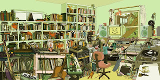
Digital illustration


Above is a hand-drawn/digital illustration for an EP by American illustration team Kozyndan (www.kozyndan.com - love them!). The title is "The Audience". The function is to be a wraparound record cover, showing the artist in his studio mixing music.

I found out about Kozyndan a few years ago and have been following them since. They have now landed major contracts with Converse and other big brands, which is testament to the quality of their work.

The style is fresh, bright and simplistic (even though it looks so cluttered). The piece is drawn in pencil first then scanned in and coloured using Photoshop. The tones in the image work harmoniously with one another, with subtle contrasts of tint with pink and green. I would say it is mostly in two thirds, with the top of the drawing remaining mostly bare compared to the chaos below. I think the intent of the drawing was to present a feeling of organised chaos. The cute creatures are customary of Kozyndan's work and add a sense of wonder.

The quality is evident in the perspectives of the room. Panoramas are quite difficult to draw whilst still retaining believable proportions, and is something they are great at.

These guys are super talented and I'd encourage you to check them out!



Thursday, February 19, 2009

Promotional posters


Above are promotional posters for various Tarantino films. I decided to include a few as they all share similar design aspects. The function of the posters is to grab your attention and pique the viewer's interest in the respective films. I have seen these posters at cinemas, video stores, on DVD covers and merchandise, as often cinema is marketed through many avenues ($$chaching$$).

The style in all of the posters is retro. The consistent use of red, black and yellow is evident in all (a nod to the first of colour printing in the 1800's perhaps?), the stenciled typography and the screen print effect give it a 70's feel. The posters all abide to the rule of thirds also.

The quality of the design is in it's apparent 'non-quality'. The distressed look in the Pulp Fiction poster mimics the textures of a well-read book, the hard edged and bold use of black print in Reservoir Dogs is simple but effective and even intimidating, the contrast of bright yellow with a very simplistic though rough streak of blood in Kill Bill instantly commands attention, whilst the rough sketch feel to the Death Proof poster adds a quirky, slightly horror-comic touch.

I enjoy the posters as much as I enjoy the films themselves. Tarantino's films have a style all of their own that touch on themes of retro, kitsch and quirk, which I feel is reflected in the posters.

Thursday, February 12, 2009

CD Design


This is an album that was thrust into my hands at Monash’s O week a few years ago in Melbourne (most likely because it’s so awful they struggled to give them away). Somehow it’s managed to follow me across the country, which is lucky since it’s given me the opportunity to put it on here.

Highlights include hand illustration mixed with digital and punchy use of complimentary colours. The front and inside covers remind me of the Rorsarch inkblot test, make of it what you will. The illo on the CD itself is a carnival ride, which ties with the album title “Moments in Movement”. I like the stark contrast of white that provides the background as it helps the colours pop.

All in all, terrible music but a cool CD design.

Thursday, February 5, 2009

Packaging design


This is Mor Cosmetics body butter. I bought it purely for the packaging, happily it also turned out to be a neat product.

The function of the packaging is to elegantly present the contents, enticing consumers with a beautiful aesthetic. 

Found it at the Bath Tub store on York (for anyone interested). 

The design is very feminine and whimsical, and quite striking with the contrast of black and neutrals. I particularly like the use of floral/fleur linework. This style really appeals to me. The typography is simplistic and does not detract from the overall packaging. 

Overall it has quite a romantic feel, the use of colours suggest opulence and luxury, which is what drew me to the product initially.

Followers